Realtor Application
Overview
I originally developed this application as part of coursework for a JavaScript programming class. It allows the user to search for real estate, view a map and comparable nearby properties, and calculate monthly mortgage payments.
The initial design and specifications were provided to me, but once I finished programming the application, I updated the design in an attempt to make it more usable. My intent was to create a simple, straightforward experience without too many features and options, and focus on providing something that potential home buyers would actually use to keep track of properties they were considering purchasing. Robinhood, a minimalist brokerage mobile app, which includes only essential information about stocks and leaves out detailed information that most other brokerage apps include, served as inspiration.
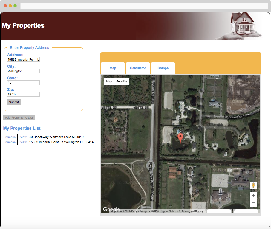
The map functionality, shown below, is integrated using the Google Maps API. Properties can be saved in local browser storage in the "My Properties List" section.
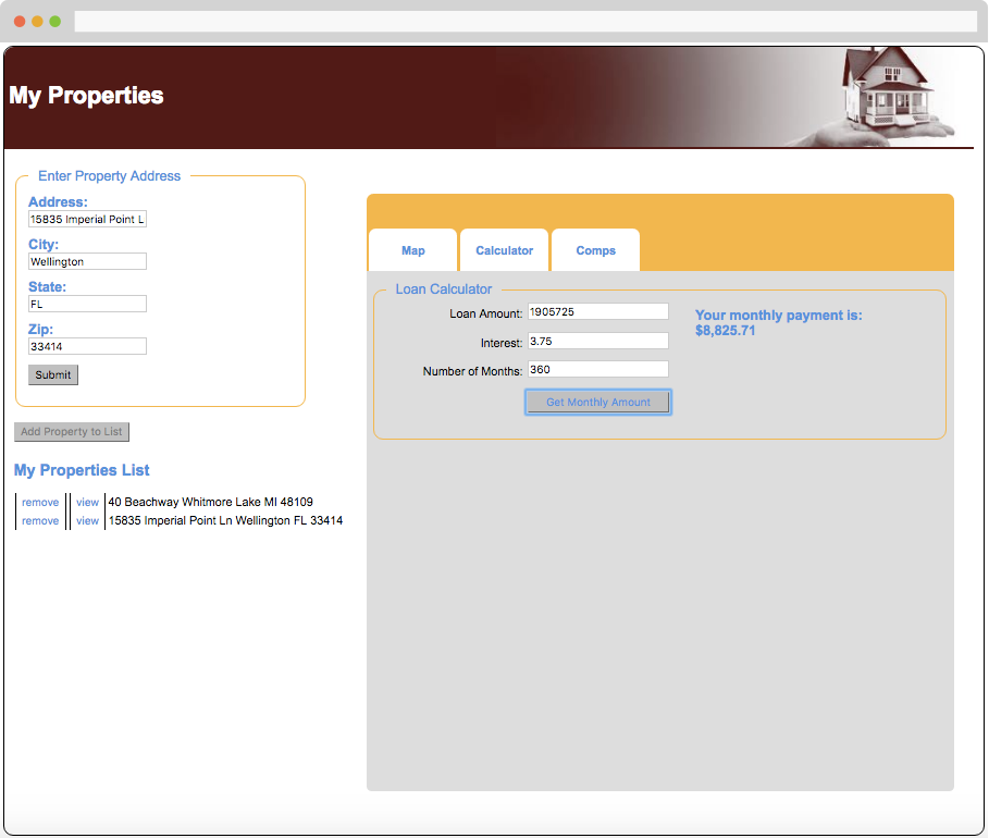
The user can also estimate a monthly mortgage payment using the calculator.
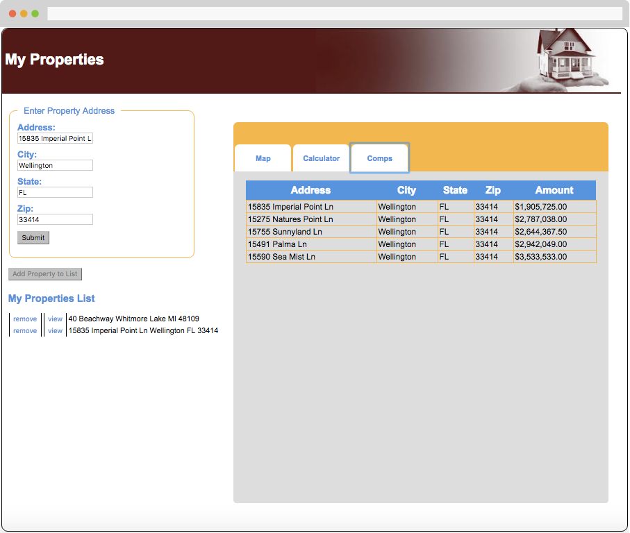
Additionally, comps for the property van be viewed, integrated using the Zillow API.
Application Redesign: Findings from User Testing
Since the application was live and fully functional, I simply asked willing testers to search for their own homes, and watched how they interacted with the app. This initial phase of user testing was admittedly very free-form, and in hindsight it should have been more rigorous and task-oriented, but I did gain some valuable insights from monitoring users as they interacted with the application and asking them to share their thoughts. My findings included:
- The design looks and feels dated. It would be far more useful as a mobile app, or at least a responsive website, since most people would probably want to use it while out looking at homes.
- Say something to the effect of “Powered by Zillow,” the site whose API I used for the property overview and comps information, to lend the app credibility.
- In the loan calculator, the “Loan Amount” field should be filled in automatically based on the estimated value of the property returned from Zillow, rather than requiring the user to remember the amount and entering it themselves. Be mindful of people's short-term memory capacity.
- A “Down Payment” field should be added below the loan amount field so that the user can see the effect varying down payment amounts have on the monthly payment.
- The loan term field (“Number of Months”) should ask for the mortgage length in years rather than months, since mortgage terms are usually expressed in years.
- There should be a better indication of which tab (Map, Calculator, or Comps) is currently active.
- “Add Property to List” is vague. Consider changing it to “Save Property to List,” or "Save as Favorite."
- Throw an error message if the property can’t be found. Currently, no results show, and there is no feedback letting the user know what went wrong, which is frustrating and makes for a bad experience.
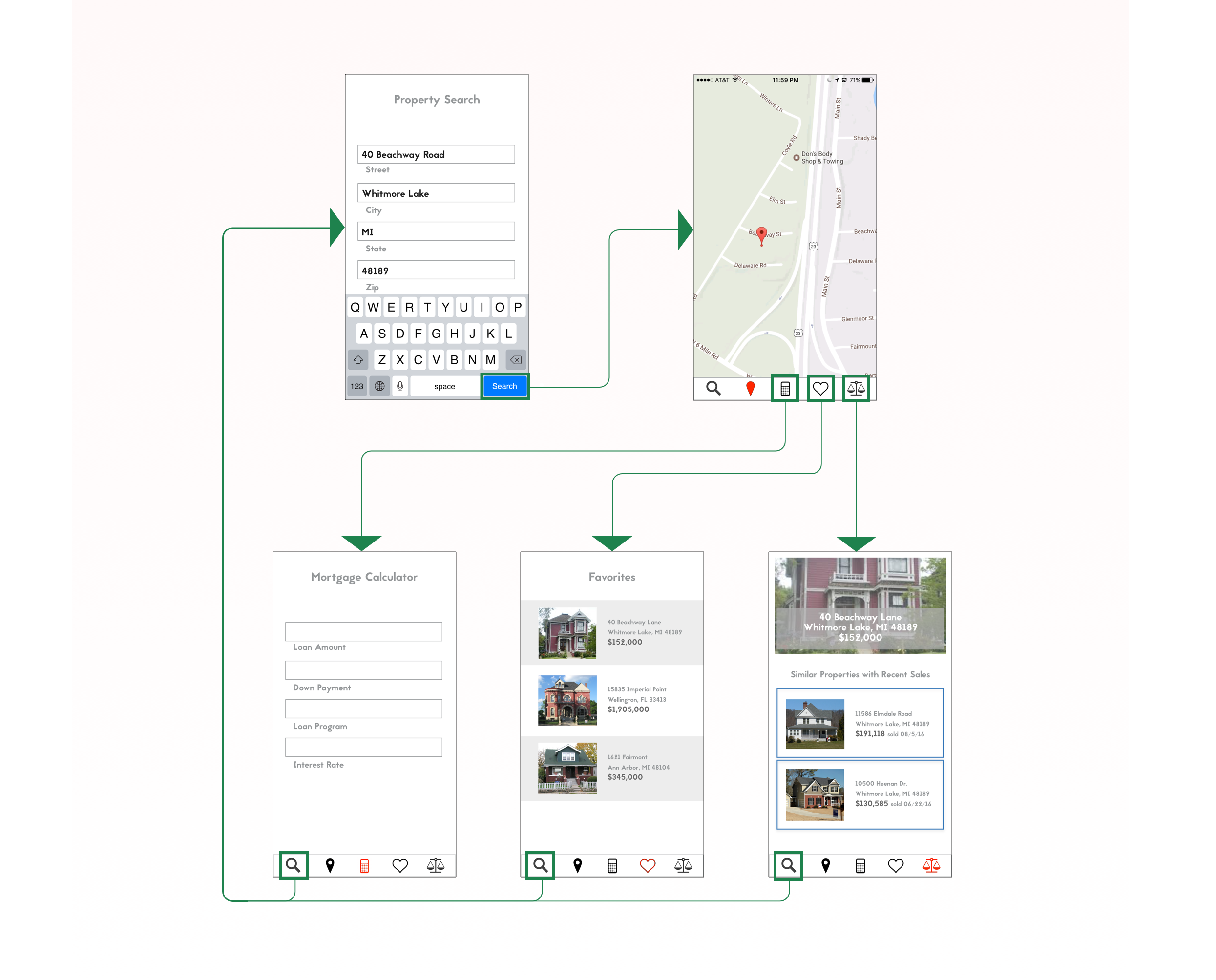
First Iteration: Design
Since I use an iPhone, I designed the mobile app with iOS in mind. I started by simply drawing each page of the app to quickly get down my ideas on how to address user feedback, without getting bogged down in the visual design.
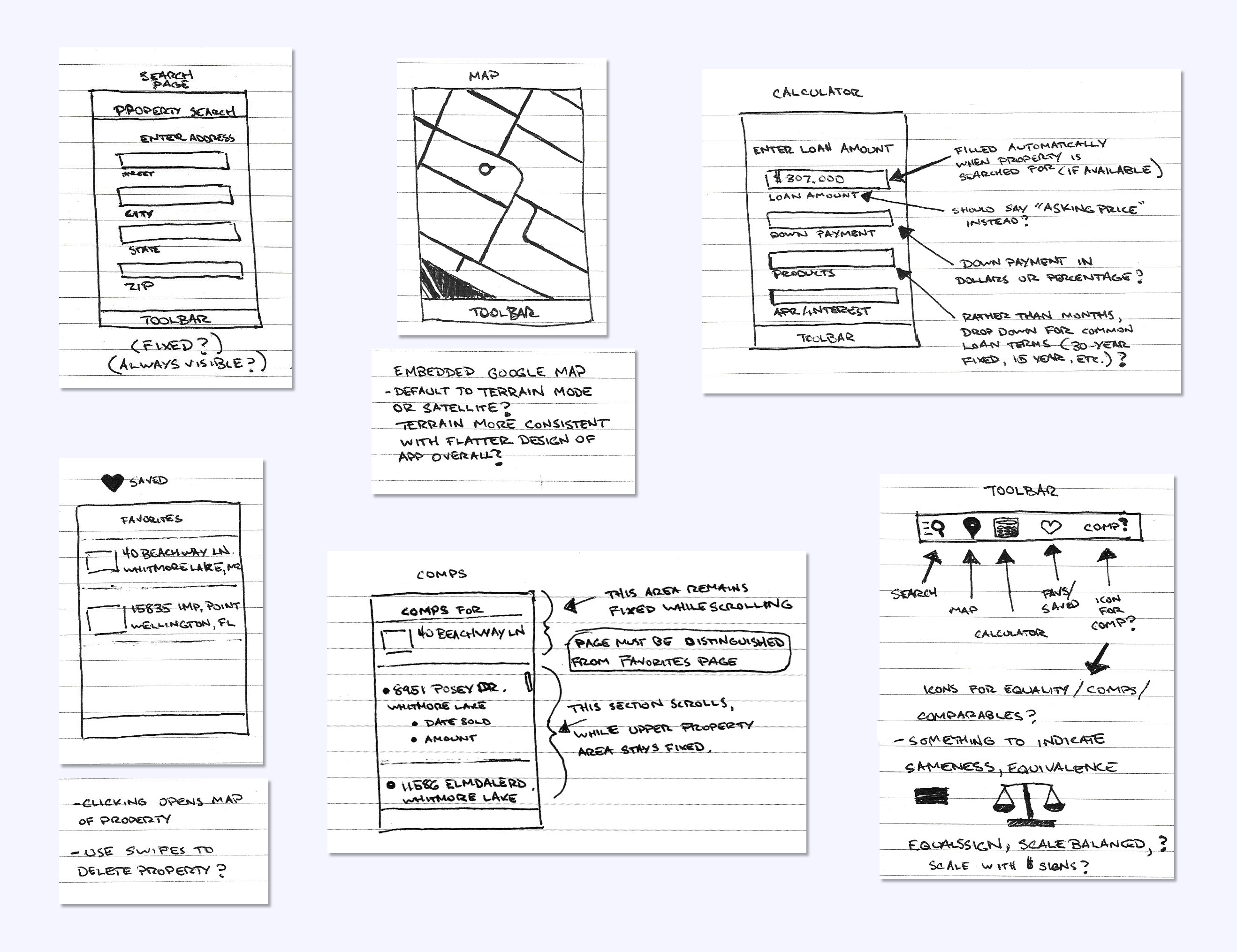
I then created a basic wireframe of the app using Adobe Experience Design (XD), as an alternative to Sketch, which I’ve used for most similar projects in the past. As I put the prototype together, I began to see fundamental problems with my design, but I went ahead with a user test to confirm. I asked a friend to try the prototype in order to determine whether my chosen icons were easily identifiable (particularly ‘comps,’ which have no clear iconographic analog), and to check that the basic design made sense.
First Iteration: Testing and Results
I asked the user to:
- Search for a property, then check for similar properties
- Find where the property is located
- Figure out what an estimated monthly mortgage payment for the property would be
It very quickly became clear that the design, which was basically a direct port of the original desktop application’s design to a mobile environment, wasn’t working. Like in the original desktop application, when a user searched for a property, they were first shown the property on the map. But on the mobile application, since the map view hid the property search form (which also served as an orienting anchor for the user), the user felt disoriented. I initially thought a good solution would be to display the property’s address at the top of each page.
But displaying the address at the top of every page didn’t make sense—in particular, it did not belong on the search and favorites pages. I realized that the navigation menu contained a confusing mixture of property-specific (map, calculator, comps) and “global” (search, favorites) navigation options, and that these two navigation categories needed to be separated.
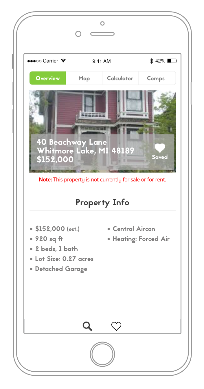
The user also felt a bit disoriented when shown a map immediately after searching. They felt the “comps” page would be the better page to show immediately after searching, since it had a picture of the home and its value. I then realized what was actually needed was a "Property Overview" page, showing images of the property, basic information about it, and its estimated value. From here, the user would have a sense of what type of property they’ve just searched for, and would hopefully feel more oriented within the app. Using the overview page as a "home base," they would feel comfortable to explore the app further.
To summarize the results:
- Instead of showing the map upon searching for a property, show a property overview page to better orient the user.
- The menu is improperly organized. It needs to be separated into global and property-specific options. Each property-specific page should clearly show the address to keep the user oriented and reassure them that they are viewing the property they think they’re viewing, without going back to the overview page.
- Add a ‘Like’ or 'Save' button—there’s a favorites page, but no way to save a favorite.
Second Iteration: Design
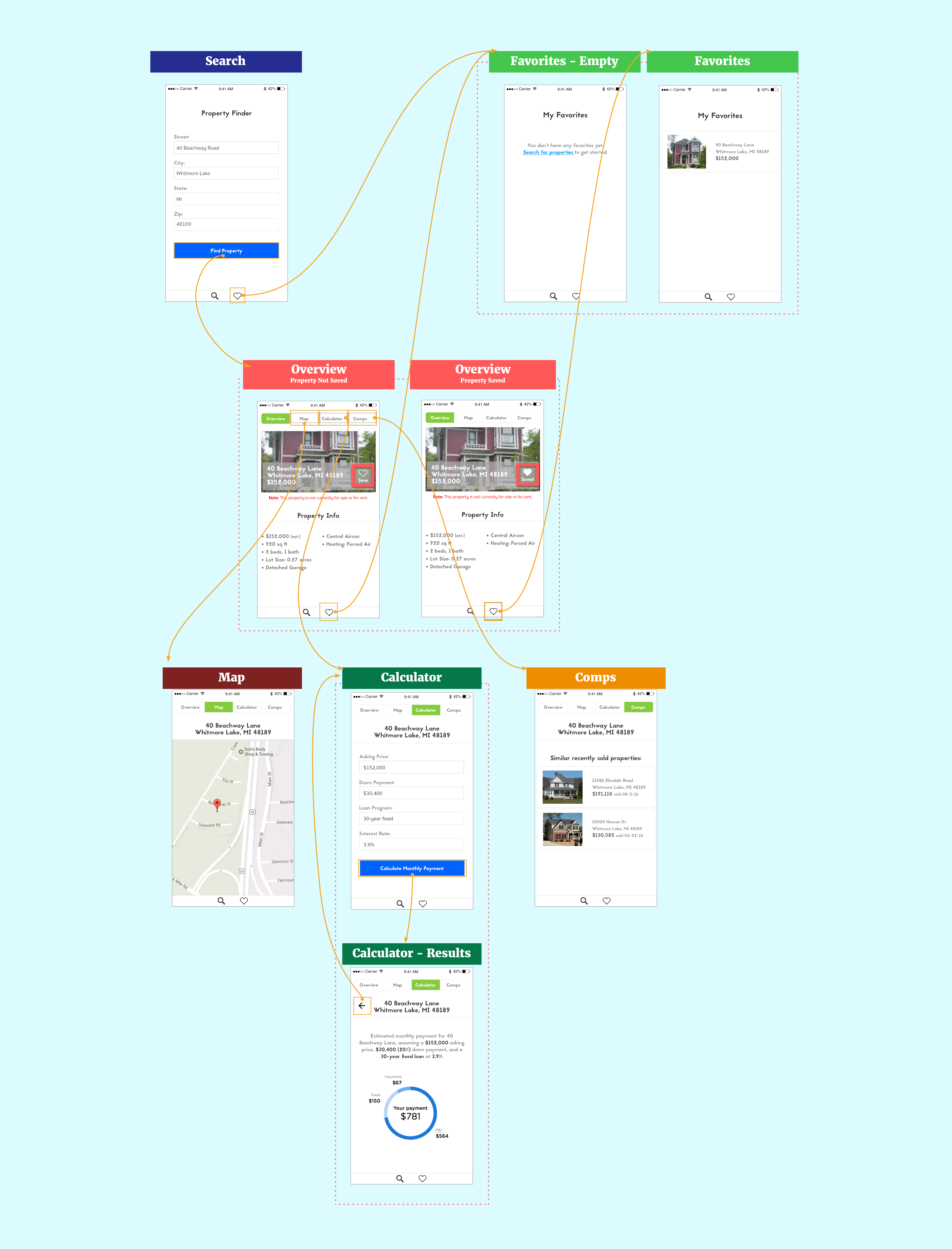
An "Overview" page was added, which displays an image of the property, cost information, and basic information about the house. From this page, the user can navigate to the other property-specific pages, including Map, Calculator, and Comps. In keeping with iOS design standards, I moved the global navigation items to a tab bar along the bottom of the app screen, and the property-specific items to a navigation bar across the top. A "Save" button was also added:
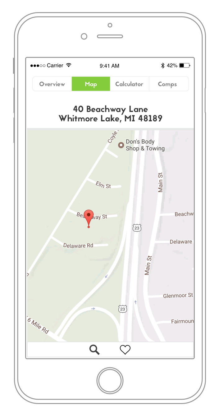
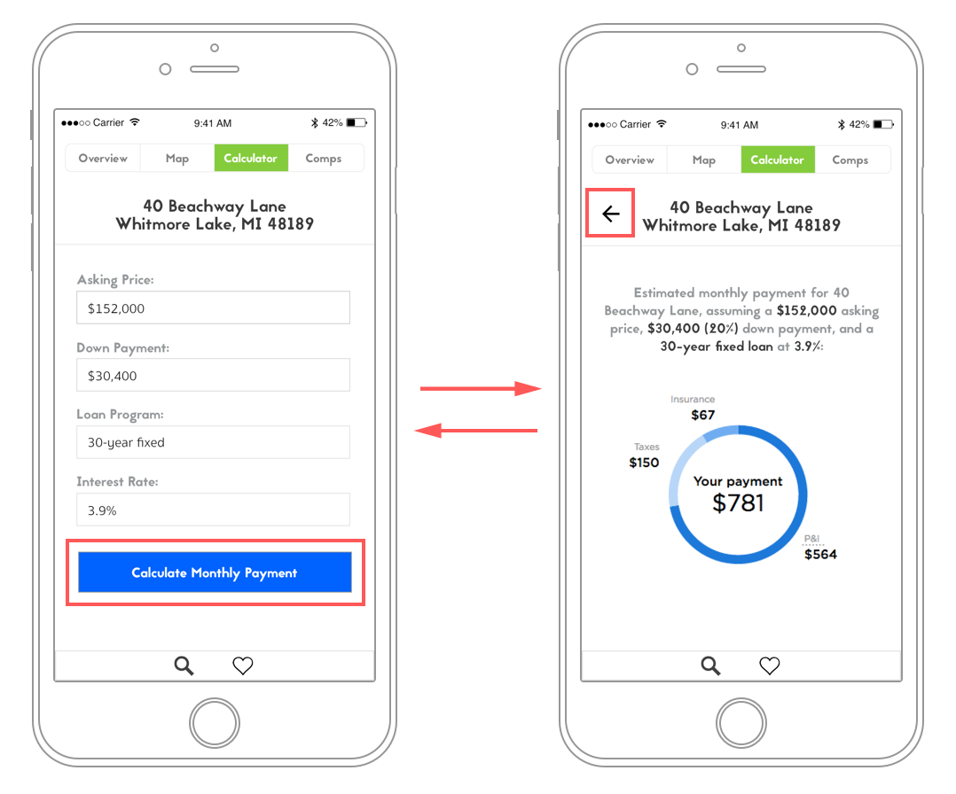
The Map page displays the property's address prominently, keeping the user better oriented.
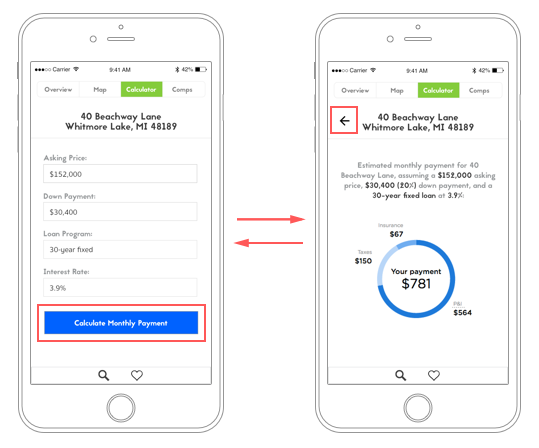
The Calculator results page summarizes everything entered so that the user doesn't have to recall the values they entered in every field (again, accomodating people's short-term memory capacity). The back button sends the user back to the form if they want to make a change, with the original values still in the form fields.
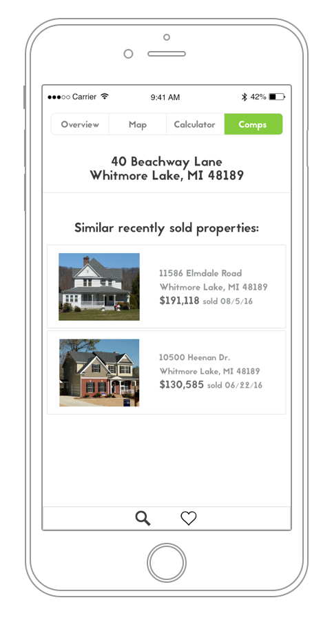
Much of the information from the Comps page has been moved to the Overview page, leaving just a picture, location, and cost estimate for each comparable property. Clicking one of the comps on this page would take the user to an Overview page for that property.
The basic app flow:
Second Iteration: Testing and Results
The next round of user testing was more rigorous, and I recruited recent home buyers in order to more accurately assess the usability and usefulness of the app.
I developed scenarios and essential tasks following a "task-centered" design approach. The goal was to come up with clear, actionable tasks that weren’t too complex, didn’t explicitly direct the user to use particular app features, and were presented in such a way that they didn’t give too many clues to the user as to what steps to take to accomplish the tasks.
The scenarios presented were as follows:
- Scenario 1: You’re a home buyer, interested in the property at 40 Beachway Lane in Whitmore Lake, MI. Search for and save this property, then see what other similar properties were recently sold for in order to get an idea of the value of the home.
- Scenario 2: Determine if this home fits your budget of $25,000 for a down payment, and a monthly payment of $900.
Users were able to accomplish the tasks put forth in the scenarios without too much difficulty, but additional issues and suggestions surfaced as they went through the scenarios.
- Since people are often buying real estate as a couple, there should be a way to easily send a property to someone else using iOS sharing.
- If a user clicks the search button accidentally, or decides they don’t want to do a new search after all, they need to be able to get back to the property they were on previously without searching for it again.
- Consider showing the picture of the property more clearly, without the address as an overlay on top of the picture of the house/property. It’s also easy to miss the "Save" button - consider moving it below the picture, perhaps next to the share button.
- The navigation menu buttons are a little small and difficult to press. This could be due to the prototyping software, but after further research, I found that hit targets should be at least 44x44 pixels on iOS devices with retina displays, so consider increasing the size of the navigation bar items to make them easier to select.
- In its current state, the app is very suburban-centric. It’s not suited to dense urban environments—there’s no apartment number field, for instance.
Next Steps and Final Thoughts
After the next iteration, I hope to identify people currently seeking homes and have them try out the app during the purchasing process. I would also try to recruit more users for this phase—but not too many more. The first round of testing had just one user, while the second had two. But as usability expert Steve Krug points out in his book Rocket Surgery Made Easy, three participants is usually enough—“The first three users are very likely to encounter many of the most significant problems related to the tasks you’re testing. (pg. 43)” There’s a tendency for people testing to fixate on quantitative results, and make extensive use of analytics, but, he says, “if I had to choose between awesome analytics that could tell me exactly what my users are doing...or sitting with one user for an hour, with the ability to hear what he’s thinking and ask probing questions, I’d take the one user every time. (pg. 19)”
The general consensus from users is that the app is far more useful and attractive after the redesign. Users also felt that the updated design and consistency with modern app design trends make it feel more “trustworthy.” Before the redesign, the application felt very dated, and one wonders if the creators of an application are cutting corners with design and presentation, are they also skimping on things like data security? In a business context, good design is important not only because of the positive experiences and emotions it can elicit, and keeping users wanting to continue to use your product, but also because of the credibility it affords to the entire business as part of its public face.
Finally, important insights from testing came when I asked people from totally different geographic areas to try out the app. For instance, most homes in the Midwestern United States are single-family with detached garages and yards, but a user in Boston pointed out that a field for the unit number was needed in the property search form, since most homes in dense urban areas are single units within larger buildings. Although a minor detail, this was an important reminder that when designing, we have to be careful not to make assumptions about users based on our own experiences. It’s crucial to take into account how a product will be used by different people in different circumstances and conditions, since what we think we know about the world often does not match reality.